Some days you just need something to be hopeful about.
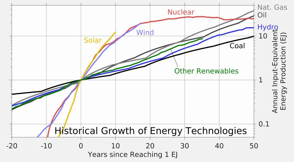
This chart is one of those for me. Solar power has been the fastest growing energy technology in history, and wind has only been slightly slower.
Still a long ways to go, but this growth points the way to a possible clean energy future.
“annual input equivalent energy production (EJ)” isn’t really understandable without thinking about it for a second. I don’t think misleading is the correct word to use but I can’t think of a better one.
That’s a weird misleading diagram IMO.
I think it makes a lot of sense, why is it misleading?
“annual input equivalent energy production (EJ)” isn’t really understandable without thinking about it for a second. I don’t think misleading is the correct word to use but I can’t think of a better one.
Exactly.