
If you were asked to pick the most annoying of the various Microsoft Windows interfaces that have appeared over the years, there’s a reasonable chance that Windows 8’s Metro start screen and interface design language would make it your choice. In 2012 the software company abandoned their tried-and-tested desktop whose roots extended back to Windows 95 in favor of the colorful blocks it had created for its line of music players and mobile phones.
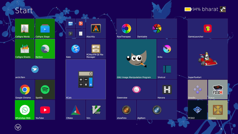
Consumers weren’t impressed and it was quickly shelved in subsequent versions, but should you wish to revisit Metro you can now get the experience on Linux. [er-bharat] has created Win8DE, a shell for Wayland window managers that brings the Metro interface — or something very like it — to the open source operating system.
The most beautiful horror to ever exist lmao
i’m one of them - i loved the ideas behind it and its potential
it was realised in the zune and windows phone UIs but unfortunately too unpopular to make progress in the desktop
I loved the Windows Phone UI but I absolutely hated the tiled menu on desktop. It was actually the main reason I left windows behind.
I KNEW one of you 3 was a Lemmy user
Another here - it was great if you bothered to set up groups. Filter for the name quickly on the keyboard.
It was set up by default to be kind of shitty, wasn’t explained well to users, and overall a failure - IMO - of presentation, not product.
Windows Phone UI, especially version 7, was amazing to use. Unfortunately the UI got worse in version 8, IMO, and the concept was even more badly implemented in Windows 8.