Instead of recommending Lemmy in general, you should recommend a specific instance which matches the audience. For example someone posted about piefed.ca in /r/BuyCanadian. Or you can link to a different frontend like vger.app.
I did make a redesign to join-lemmy.org recently so that new users can reach the registration page with a single click. I am also curious about any suggestions you have to improve the onboarding.
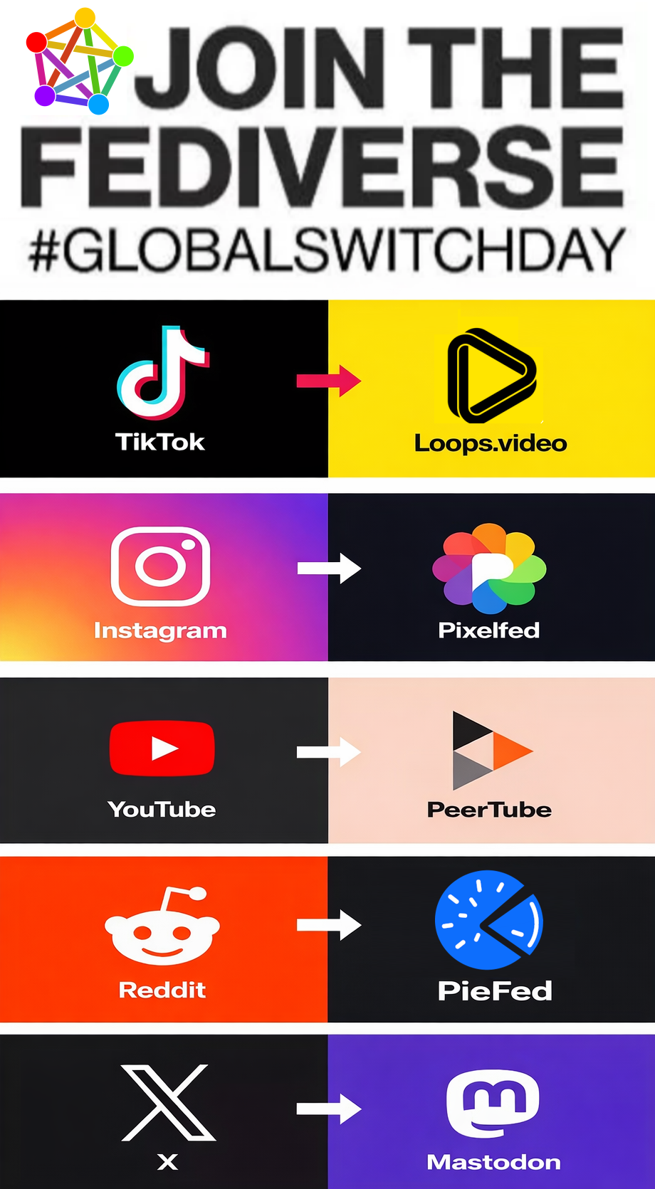
join-lemmy.org looks much improved now! And yes linking directly to an instance is the way to go, I would’ve put URLs in this promotional image instead of just names
I’m not sure if I have any specific ideas at the moment. It’s possible Lemmy has just reached a saturation point with Reddit where the people still on Reddit are the ones who bounced off Lemmy before, so they won’t give it another chance anytime soon, but they haven’t tried PieFed yet. Maybe the optimal strategy is to cycle between the recommendations to catch everyone with whatever suits them best. I think we should also try changing out the Mastodon recommendation and see if something else catches people who haven’t already switched to Fediverse microblogging.
I think PieFed’s idea of asking new users what they want/don’t want to see is a good idea.
And so you decided to spread that misinformation further, instead of simply replying that it is wrong? I’m also very curious in what ways you consider Piefed’s UI better than Lemmy.
Good UX is all about removing friction and making users have to click less and think less.
Users these days are expect their hands to be held and things to just work, that sadly is just the reality.
Let me start off with saying, I started on Lemmy and even donated to Lemmy, PieFed can only grow because it’s standing on the shoulders of giants (lemmy)
My alt is AnonomousWolf, you can look it up, since I joined I complained about bat UX, but people told me to GTFO.
PieFed fixes many of those issues I complained about.
Let me do a quick test and walk you through my thought possesses and UX.
I’ll make 2 comments in this post, one for lemmy.ml one for piefed.social
With PieFed I can just keep scrolling without needing to click.
Things just work and are where I expect them to be (based on pas UX experiences (reddit))
I can see way more content without ever getting confused or needing to click or make decisions, making me stay curious and engaged.
Where as with Lemmy I very quickly got frustrated and confused, making me want to abandon ship and do something else, and I’m way way way more resilient than the vast majority of users
– some meme about cars and fuck Trump, cool
– keep scrolling
– more memes and cats, keep scrolling
– this keeps happening, doezens of more memes and cats
– repeat
– bunch of posts I don’t have to click to open, I can see the image clearly and what’s happening
– interesting but I can just keep scrolling
– bottom of the pace, have to click next
– more semi interseting things
– keep scrolling, click next again
– eventually find something interesting enough to interact with and leave a comment, of move on.
– open https://lemmy.ml
– met with a list of posts, most images too small for me to see or read.
– click on first post so that I can see the image - https://lemmy.ml/post/42503928
– taken to a page where I still can’t see the image I clicked to see
– Click on the image, now I can see it.
– See some comments
– now I need to click back to continue
– see another interesting post, image to small, can’t see so I have to click – https://lemmy.ml/post/42501566
– Still can’t see image so I click on the image
– now I’m taken to https://mecha.so/comet#overview
– WTF, why am I on a different site? Why am I here,where are the comments
– Realisze I can’t distinguish between Image posts and Links to a different site.
– Why is this so confusing to browse?


Instead of recommending Lemmy in general, you should recommend a specific instance which matches the audience. For example someone posted about piefed.ca in /r/BuyCanadian. Or you can link to a different frontend like vger.app.
I did make a redesign to join-lemmy.org recently so that new users can reach the registration page with a single click. I am also curious about any suggestions you have to improve the onboarding.
join-lemmy.org looks much improved now! And yes linking directly to an instance is the way to go, I would’ve put URLs in this promotional image instead of just names
I’m not sure if I have any specific ideas at the moment. It’s possible Lemmy has just reached a saturation point with Reddit where the people still on Reddit are the ones who bounced off Lemmy before, so they won’t give it another chance anytime soon, but they haven’t tried PieFed yet. Maybe the optimal strategy is to cycle between the recommendations to catch everyone with whatever suits them best. I think we should also try changing out the Mastodon recommendation and see if something else catches people who haven’t already switched to Fediverse microblogging.
I think PieFed’s idea of asking new users what they want/don’t want to see is a good idea.
That person was me.
I’ve promoted Lemmy in the past only to be met with comments complaining about the ‘dogshit UX’ and tankeis.
So I switched to promoting PieFed instead, and have had no such complaints.
And so you decided to spread that misinformation further, instead of simply replying that it is wrong? I’m also very curious in what ways you consider Piefed’s UI better than Lemmy.
Good UX is all about removing friction and making users have to click less and think less.
Users these days are expect their hands to be held and things to just work, that sadly is just the reality.
Let me start off with saying, I started on Lemmy and even donated to Lemmy, PieFed can only grow because it’s standing on the shoulders of giants (lemmy)
My alt is AnonomousWolf, you can look it up, since I joined I complained about bat UX, but people told me to GTFO. PieFed fixes many of those issues I complained about.
Let me do a quick test and walk you through my thought possesses and UX. I’ll make 2 comments in this post, one for lemmy.ml one for piefed.social
Review of the two experiences:
With PieFed I can just keep scrolling without needing to click. Things just work and are where I expect them to be (based on pas UX experiences (reddit)) I can see way more content without ever getting confused or needing to click or make decisions, making me stay curious and engaged. Where as with Lemmy I very quickly got frustrated and confused, making me want to abandon ship and do something else, and I’m way way way more resilient than the vast majority of users
– open https://piefed.social/ – met with some interesting image from c/selfhosted
–keep scrolling – some news articles, not really my vibe
– keep scrolling – cut cat picture from c/cat – keep scrolling
– some meme about cars and fuck Trump, cool – keep scrolling – more memes and cats, keep scrolling – this keeps happening, doezens of more memes and cats – repeat
– bunch of posts I don’t have to click to open, I can see the image clearly and what’s happening
– interesting but I can just keep scrolling – bottom of the pace, have to click next
– more semi interseting things
– keep scrolling, click next again
– eventually find something interesting enough to interact with and leave a comment, of move on.
– open https://lemmy.ml
– met with a list of posts, most images too small for me to see or read.
– click on first post so that I can see the image - https://lemmy.ml/post/42503928 – taken to a page where I still can’t see the image I clicked to see – Click on the image, now I can see it.
– See some comments
– now I need to click back to continue
– see another interesting post, image to small, can’t see so I have to click – https://lemmy.ml/post/42501566
– Still can’t see image so I click on the image – now I’m taken to https://mecha.so/comet#overview
– WTF, why am I on a different site? Why am I here,where are the comments – Realisze I can’t distinguish between Image posts and Links to a different site. – Why is this so confusing to browse?