
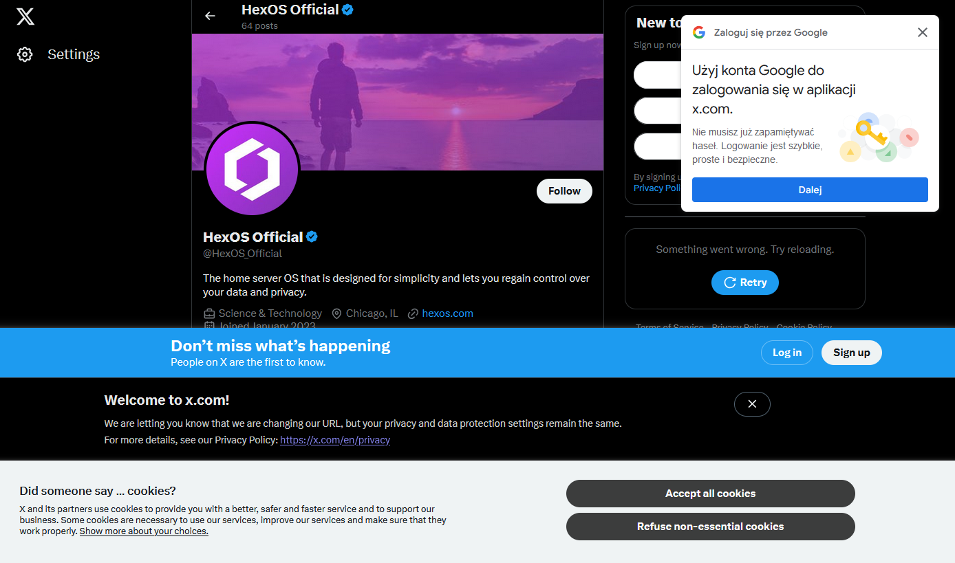
I happened to click a link that took me to the associated twitter X account for something I was interested in and was greeted by not one, not two, but four modern day web popups.
I know it’s nothing new. I’ve got a couple of firefox plugins that are usually quite good at hiding this sort of nonsense, but I guess they failed me today (or, I shudder to think, there were even more that were blocked, and this is what got through)
What’s the worst new/not-signed-in user experience you’ve encountered recently?
Please unblock challenges.cloudflare.com to proceed
(grumble, unblock, reload)Verify you are human
(click)…spin…spin…spin…
Verify you are human
(click)…spin…spin…spin…
Verify you are human
(click)…spin…spin…spin…
Verify you are human
(click)…spin…spin…spin…
Verify you are human
(click)…spin…spin…spin…
https://privacypass.github.io/ has helped somewhat
Privacy Pass will generate a number of random nonces that will be used as tokens
British people making a double take
Privacy Pass just randomly generated Prince Andrew and now my browser is all sweaty.
The web. It was good while it lasted.
robots.txt is the perfect summary of the web era. A plain text file that politely asked web crawlers not to do certain things. Such an innocent time.
I have a very hard time believing that these companies are unaware of how auful this shit makes their webpages.
Anybody know why google has a popup on every major website now? And more importantly, how to get rid of that without creating an account?
Disable all third party JS in uBlock origin
That can cause the page to fail to load in some instances.
Some specific websites might need tweaking but from anecdotal evidence about 90% of websites work just fine. YMMV though because I don’t visit twitter
A number of the more tech savvy online newspapers have begun enforcing client-side scripts as a means of preventing people from reading articles without a subscription.
Gemini is an attempt at trying to bring the old web back, although with some technical limitations.
I heavily disagree with this. Stepping back to “walls of text with hyperlinks” is a bad idea that’ll service no one and will never succeed in any reasonable capacity.
Current web technology is not what caused bad web. The exception would be too powerful js where js should only provide interactivity and extra flavor to the page rather than run a full application which can fingerprint and punish user agents.
Javascript, embeded images and audio are awesome things that can improve content readability a thousand fold. Just look at best docs on the web - all of them use these features to tend their users. Even wikipedia added js flavoring like hover pop ups. Because it works.
deleted by creator
But lack of ability does not prevent any of that. Entrepreneurs who want to monetize stuff will find a way to spam and game the system.
As someone whos responsible for docs and public facing material I’d never push text only content these days. There’s just way too much UX value left out with this limitation. Sometimes more is more.
Additionally I’d argue that people who only want text are have advantage in the current system as you can strip and reformat everything on the front end and nobody will ever know or bully you into accepting their system. Just like nobody cared about ad blockers before they were widely adopted.
For me, multimedia is a non-negotiable part of the web experience.
Yes, I get as annoyed as the next guy when I want, say, a simple tutorial written in a couple paragraphs, but the only ones anyone seem to want to make are eight minute long videos filled with fluff. That sucks. But purposefully excluding it from your protocol because it burned you a fee times is a gross overcorrection in my view.
I appreciate the Gemini project, I respect its goals, and I am happy that it meets the needs of several people such as yourself. But for me, and I think for a great majority of people who would be potentially interested in its broader goal of simplifying the web but are dealbroken by lack of multimedia capabilities, Gemini will never be anything more than a toy. A quirky little curiosity that will never expand beyond a tiny clique of people who accept Gemini for what it is and are content to only ever see content from that same small pool of people.
It’s kind of bothersome how almost blind I am to them now. I habitually find a way to close them without having to read or focus my eyes on anything. That’s not to say it isn’t still an annoyance.
[This comment has been deleted by an automated system]
The different popups just show how bad design the web is today.
Ask cookie question is required.
Login? Always create an account and proceed with all signup questions.
Agreement? Read them 1 hour until you have understood everything.
Webbrowser: can I get your location? And please the mic and video too!
Finally, don’t forget the ads!
Agreement? Read them 1 hour until you have understood everything.
I one time for fun (cause I’m insane) read the entire Windows license agreement, MSA (Microsoft Services Agreement), and privacy policy. It took me 1 hour and 45 minutes, I timed it.
I could imagine they’d be interested in you over here: Tosdr.org
try opening fanwiki in a phone
For minecraft players: Remember to only open minecraft.wiki links
EU: “You can’t just collect people’s data, you have to ask permission first and give people the opportunity to decline.”
Site Developers: “Fine, but we’re going to comply in the most malicious manner possible.”
HEY DO YOU WANT COOKIES ARE YOU SURE PLEASE HIT THE BIG BLUE BUTTON FOR COOKIES THEY ARE HELPFUL AND GOOD PLEASE GIVE COOKIES!!!
It’d be fun if the EU started policing any use of the phrase “We are required to show this dialog”.
They’re not. They choose to show that dialog so that they can try to apply commercial tracking cookies. Anything for website function is already covered by EU laws.
There have been a couple of changes to the rule since it came into effect. Originally, the pop up could effectively occlude the “Do Not Enable Cookies” button behind a maze of “Optional” settings. The end result was a big colorful “I Consent” button and a tiny little gear button with a thousand manual checkboxes to uncheck every time you visited the site.
The regulations were updated since. Now these annoying pop-ups at least tend to have a clearly defined “Yes, I Consent” / “No, I Do Not” at equal scale and opposite color, allowing you to bypass it without going into the weeds on a configuration screen.


