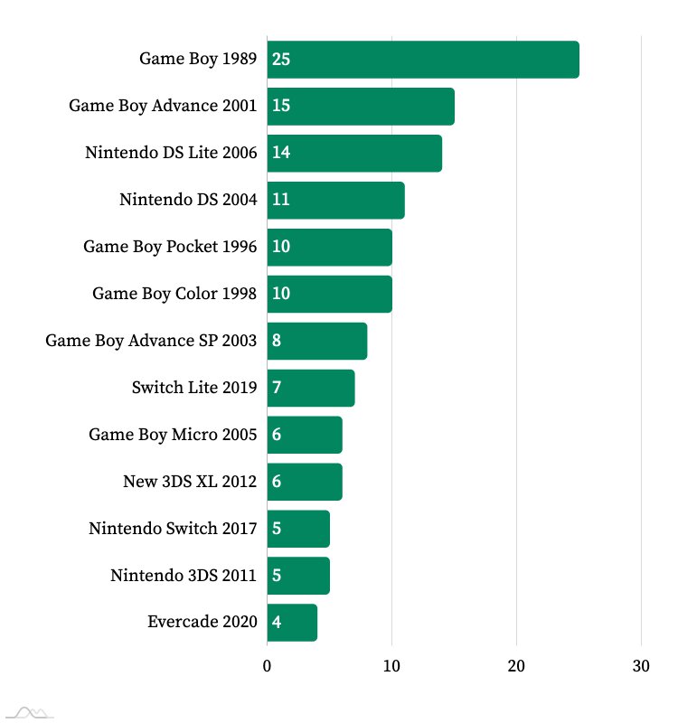
A sorted bar chart seems like a shitty way to present this if you’re trying to show a trend.
It looks like they didn’t even need to sort it that way to show a trend, I was curious so I re-sorted it.

Don’t even know what the point here is. Of course a device like the gameboy which only had dot matrix display and used four AAA batteries is gonna last longer than something like the Nintendo 3ds, which powered two separate screens, one of them displaying two images at once for a 3d effect on a lithium akku.
The cost back then for batteries was also incredibly high, you could probably charge a 3ds 1000 times before you’d come close in paying the equivalent in electricity costs.What’s surprising to me is how much battery life dropped on new iterations of old systems, like the game boy micro. Not at all sure why the evercade was thrown in.
The Gameboy micro was as the name implies very tiny, so it didn’t fit a big battery. Backlight is also a very notorious battery drain, so combined with the small battery it’s not that surprising.
Nothing’s stopping people from just playing on their old Gameboy so if the writer wants longer battery life, he can just do that.
Everytime I pull out my old Gameboy the screen with no backlight and the weight makes me quickly remember why I gladly traded battery life for power when I bought an anbernic handheld instead.This graph would make more sense to compare battery capacity and the power draw of the device… otherwise its a completely pointless metric.


