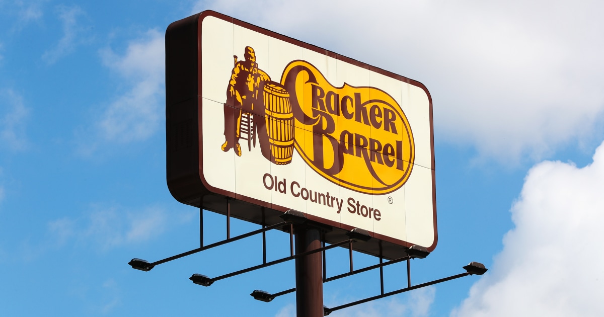
I said it in the last thread and I’ll say it again here: I do not give a single flying fuck about any political motivation behind the changing nor changing back of the Cracker Barrel logo, either real or simply perceived, but their new logo was objectively terrible. It was so bland and unmemorable that whoever designed it should have their Macbook confiscated and be catapulted into the ocean. That is, the both of them. But preferably one each into different oceans. I don’t know how much that braindead rebrand cost them in consultancy fees but I hope they can ask for a refund.

I said it in the last thread and I’ll say it again here: I do not give a single flying fuck about any political motivation behind the changing nor changing back of the Cracker Barrel logo, either real or simply perceived, but their new logo was objectively terrible. It was so bland and unmemorable that whoever designed it should have their Macbook confiscated and be catapulted into the ocean. That is, the both of them. But preferably one each into different oceans. I don’t know how much that braindead rebrand cost them in consultancy fees but I hope they can ask for a refund.
This is why it was great. It perfectly encapsulated both their food and store. It was an ideal logo for them.