- cross-posted to:
- apple_enthusiast@lemmy.world
You must log in or # to comment.
I love how that page adds snowfall over itself… Cluttered, distracting snowfall.
Irony is dead… Long live irony
No fun allowed
They also use a snowflake icon for light\dark mode rather than, you know, toggling the distracting falling element.
But, the article does bring up a lot of a valid points
It does toggle it. But they don’t disappear, just new ones stop falling in, so the existing snowflakes still need some time to exit the screen.
Ah I was just being impatient. I’m not saying it’s not a well done effect, it just seems a little pointless and not ideal in a blog talking about design
To their credit there is a button in the top navigation menu that turns off the snow.
…Also there’s a night mode button but it completely hides the entire page except for a spotlight you control by clicking around? Interesting feature but I’m not sure I understanding it.
I think it’s a joke about (or rather, a dig at) night mode. I’d seen the blog and that “dark mode” on a previous post about syntax highlighting where he’d mentioned he preferred light mode.
It’s the kind of thing I was doing in the late ’90s with DHTML, copying random scripts off websites like Dynamic Drive
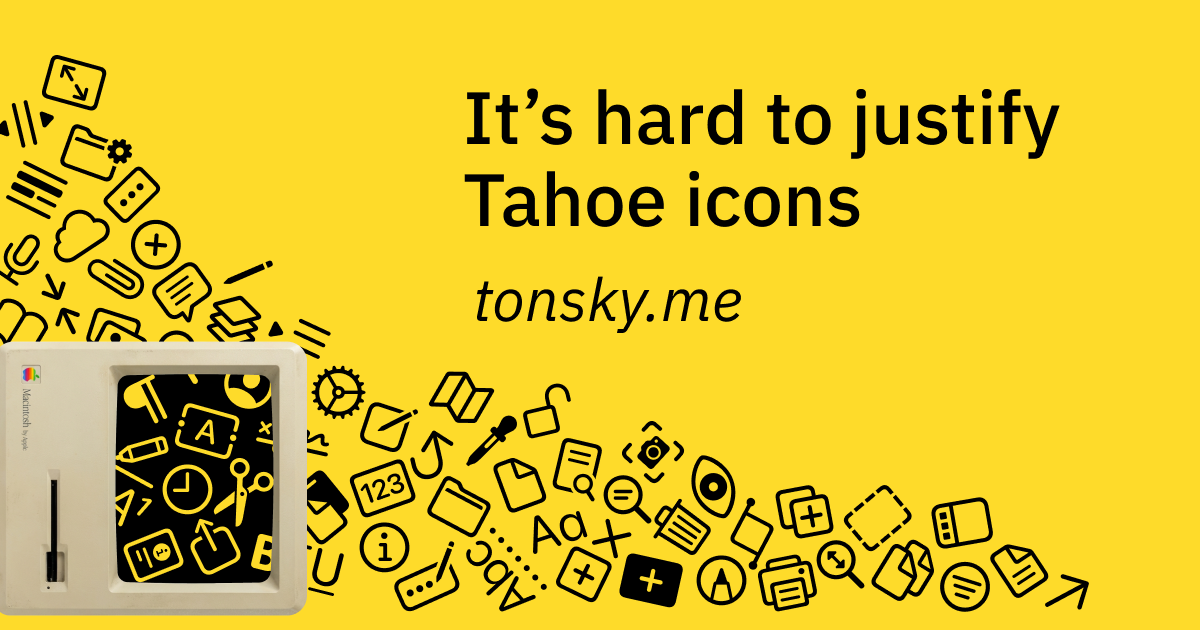
The original Mac OS human interface guidelines are full of great stuff like this.
We should return to skeuomorphism.
Is soot supposed to be pouring off the top of the screen? Thats awful.