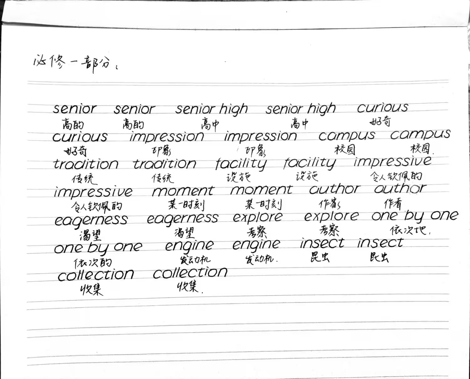
this handwriting is too good it’s going to piss someone off
I’m already triggered that mine isn’t that nice!
Little tidy for my tastes. My handwriting is very much chicken scratch.
I agree with everything everyone already said about your ascenders and descenders. I also feel like most printing that I see, the bottom of curved letters (s, c, e) tend to be slightly larger than the top. Yours seem to be opposite.
Better than mine lol
Really, all you need to do is make sure you’re fully closing the circular parts of the letters. Maybe make the tail on your “a” longer.
I am not a native english speaker, but my native langauge uses the latin alphabet. Your writing is really good especially when compared to for instance mine, when people see it they compare it with writing with a chicken’s foot. At first glance I mistaked it for a font.
Excellent! Lots of other people in thread have made minor corrections (that are mostly accurate) but you have a far more important thing - STYLE! Your penmanship has a great style made in part by those little differences! Don’t change it so much you lose that
Looks good, just need to work on a few minor things:
All of the ascenders and descenders (lines that extend above and below) need to be longer, especially on the f, d and the p. Also make sure the line on the right side of the a is clear and noticeable, it looks a lot like an o because you can hardly see that line. Overall the round parts of letters like a, d, g, p, etc are a little too wide/fat, so that combined with the vertical line parts being too short makes them look too similar to an o.
That may sound like a lot of criticism, but overall it does look very good. It just takes a lot of words to try and describe these small issues.
it looks like a computer font, not very human-like. I like your Chinese handwriting though
Super neat, extremely readable. On a few you can tell you’ve taken a long time forming the letters, so probably just need to practice until you can write at a useful speed, while keeping it as neat.
Yeah most native writers are not going to write this nicely. We write faster and more sloppily.
Way better then mine
I taught 3rd grade in the US, where kids are expected to have their printing correct and start to learn cursive. I’d say your writing is very neat and readable. It has some differences that most US adults develop when they’ve gotten used to cursive and then need to use printing. So nobody is going to have any trouble with reading this.
For instance, when little kids print, or US teachers teach it, the straight line on their e is horizontal. The stems on their a and m are straight and well-defined. Their v has a sharp point. Their f is tall, with a strong top hook and nothing below the sitting line. Their y and x made from two straight diagonal lines. And there’s no slant. But after writing in cursive for awhile, many adults form their printing similarly to you.
The only thing I’d suggest you change is to make the top part of the f stronger and more hooked. That’s the one letter that might cause confusion, even though your t has a tail to differentiate it. Your assignment doesn’t include a q, but I suggest you be sure to curve or point its tail below the line in the opposite direction from the tail on your g.
All in all, well done.
It doesn’t really look like handwriting, it’s like you’re copying/designing a digital font 🤔
Meaning it’s really nicely done!
d, h, l, f and t could all be a bit taller. Same for the line downwards from p.


box for f is wrong in second image. f always has an ascender and sometimes has a descender but is drawn with just a descender box
Good spot. And I love lowercase 𝑓 with ascender and descender.
𝑓𝑎𝑟𝑡𝑠
They wanted praise and oohs and aahs, not actual critique, though.
It’s pretty good, easier to read than most native speakers I’d say.
If I had to give a critique, I’d say the letters are rather round, so it can be hard to tell an ‘a’ from an ‘o’, but most people develop quirks like that in English so it’s perfectly fine.
Firstly, your penmanship is great, better than mine as a native tech worker.
For some actual feedback, your letter sizes for the same letters are a bit inconsistent. That just takes practice.
You are writing at a bit of a slant. That is not wrong but not that common, at least in the states.
You are trying to stay within the lines and that is causing you to change the shape of the letters if they are too large.
Your f’s could use a bit more curve. They look a little close to a t.
But seriously it looks great.
The slant in print writing I think stems from how curisve is (was?) taught in U.S elementary schools. I recall getting the very distinct advice to tilt my paper 45° for cursive writing and it ended up becoming a habit that carried over into my print writing.
Definitely I was taught to do it for cursive. My school system abandoned cursive after we learned it so I never got in that habit I guess


